New era in tobacco product: a packaging without branding

In 2021, nearly a hundred years after its popularity and massive ad campaigns, the world finally knows and accepts tobacco usage is lethal.
For decades, non-profit and health organizations have fought against the wealthiest and most influential companies, Philip Morris International, Altria, British American Tobacco, Imperial Brands, and Japan Tobacco International, to convince governments to take action.
Thanks to those who care about humanity, first, all the ads are banned, then the warning texts are included. Later we started to see smoking-related diseases pictures which is much greater than text-only warnings. These pictorial warnings are necessary for the huge number of illiterate population of the world to inform them about the health hazards of smoking. And now, tobacco companies lose their last weapon; their brandings.
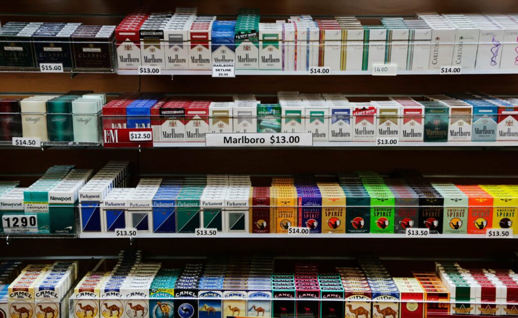
There’s lots of evidence that their packaging entices young people into smoking with its flashy logos and colors. Moreover, the tobacco industry’s documents show they have invested lots of money on their visual branding and packaging to recruit young people to start smoking their products. Neither the less, they are pushing insanely the flavored cigarettes with mint, cherry, berry, etc., to make it more attractive to the young generation! But now, the new era is about to begin…
Lead by Australia, as of October 2020, 17 countries have adopted plain packaging: Australia, Canada, France, Ireland, Israel, New Zealand, Norway, Saudi Arabia, Singapore, Slovenia, Thailand, Turkey, UK, Uruguay, Belgium, Hungary, and the Netherlands. Many more have progressed plain packaging laws and regulations to varying extents.
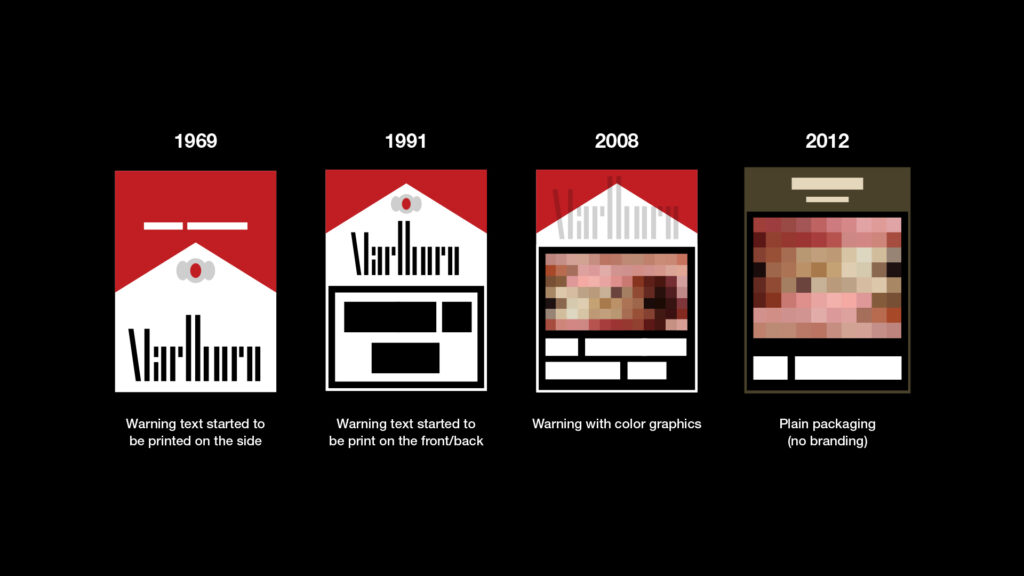
What is plain packaging?
Instead of having brandings such as name, logo, and any visual elements, all tobacco packages will be sold in one unattractive single color with more significant warnings and the same font. Plus, Misleading words like “light”, “natural” and “organic” cant be used. The text and picture warnings will take up more than 65% of the box and appear at the top, with the brand name much smaller underneath. No doubts that without their branding power, soon, we will be a witness to the end of the tobacco era.
In 2012, Australia became the first country in the world to introduce the measure. Tobacco companies there are now restricted in their use of logos, colors, and brand images and instead have to use the drab Pantone 448C color and plain font. The boxes also prominently feature warnings about the harms of smoking, including indecent images that show what cigarettes can do to the body.

The branding
While the argument about new regulations against the tobacco business continues, we would like to highlight one of the most extensive and successful ad campaigns to show how powerful the correct branding positioning and branding strategy can be.
Thanks to their successful branding and advertisement campaign of Marlboro Man, the brand has a powerful image of being the cigarette for the real man. The brain of this campaign was Leo Burnett, who is the founder of one of the most prominent advertisement companies, Leo Burnett Company. He repositioned the brand, which is founded as a women’s cigarette, into one of the most rugged masculine products in history. The “Marlboro Man” ad campaign helped Marlboro become the world’s leading cigarette brand in 1972, which it has maintained ever since. According to Forbes, more than 43 percent of all cigarettes bought in the United States in 2020 were Marlboro.
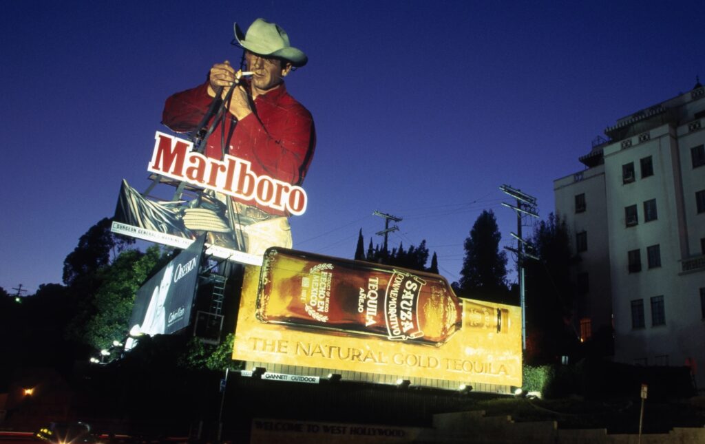
“In a world that was becoming increasingly complex and frustrating for the ordinary man, the cowboy represented an antithesis — a man whose environment was simplistic and relatively pressure-free. He was his own man in a world he owned.” – Jack Landry, former senior vice president, director of marketing, and member of the board at Philip Morris.
Prior to the cowboy campaign, Marlboro was considered a “women’s” cigarette. Their debut slogan in 1924 was “Mild As May.” Early ads presented black-and-white sketches of listless flappers, slouched over an ashtray at a bistro table—or a sultry profile of a Gibson girl whose dark lipstick remained unblemished after a drag.
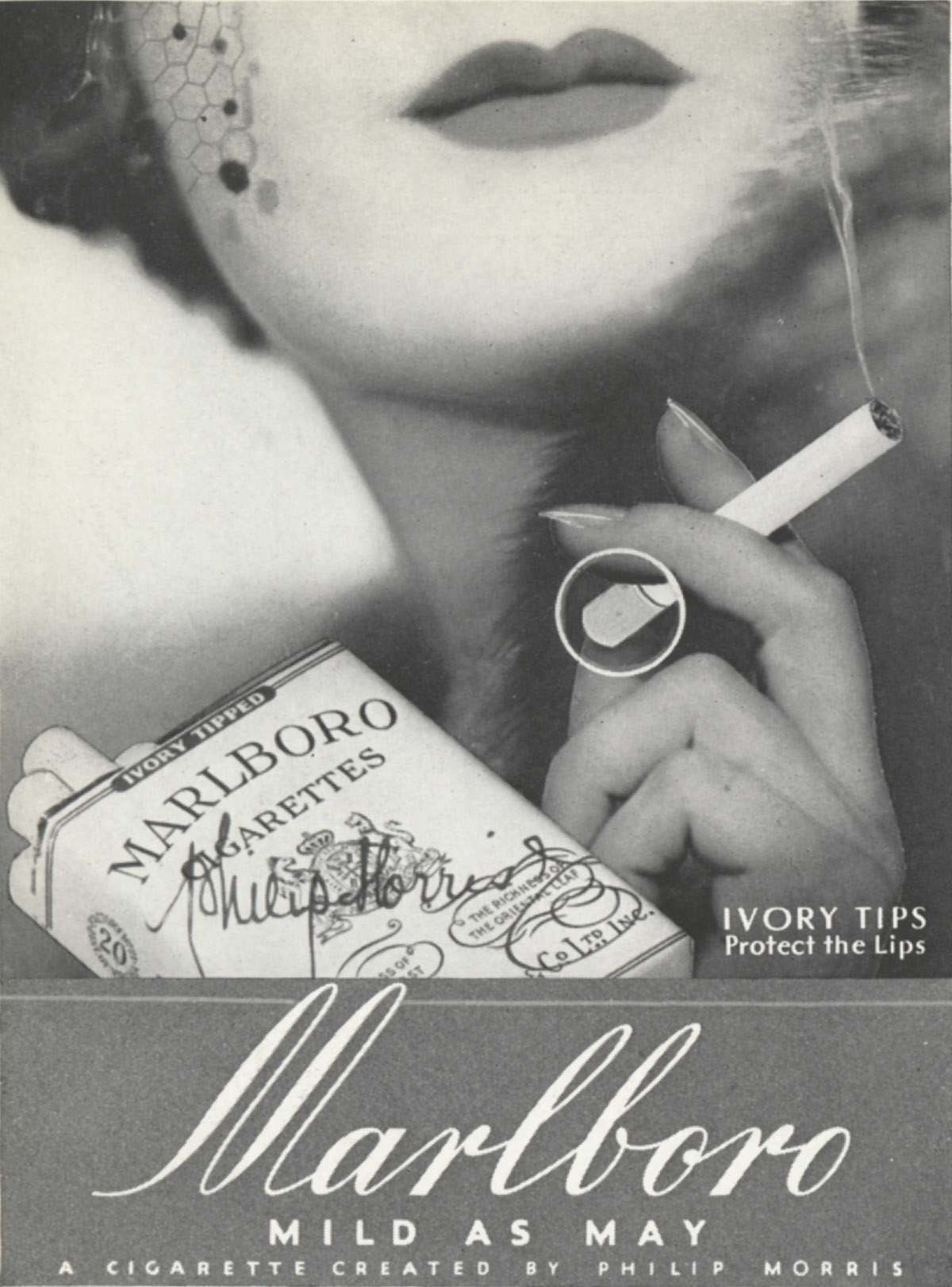
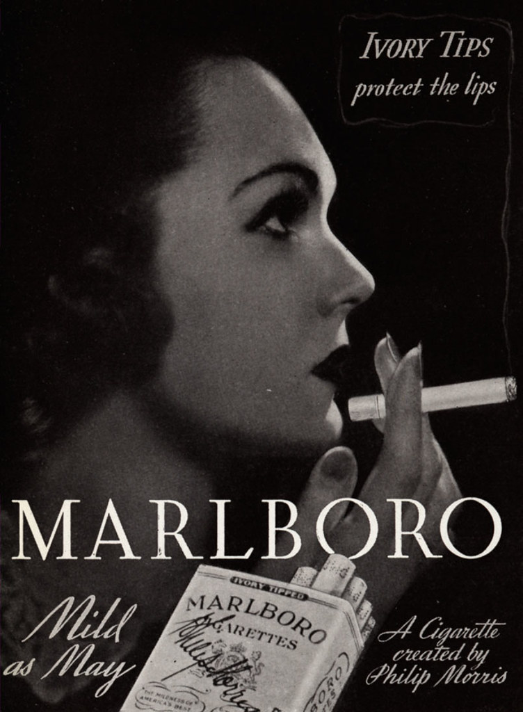
However, research shows that more women smoke Marlboro than any other brand instead of all the Marlboro Man ad campaign attempts. So despite Phillip Morris’ attempt to create advertising that appealed to men, they ended up drawing in women, too—which means that the Marlboro Man campaign wasn’t about being a man after all: it was about being American—and maybe more specifically, a white American.
Within a year of Marlboro Man’s debut, the company went from holding only a one percent market share to being the fourth bestselling brand in America. Moreover, America loved Marlboros: Sales hit $5 billion in 1955, an over 3000 percent increase over 1954—the year before the Marlboro Man campaign.
“The Marlboro Man stood as an iconic symbol, an individual in control of his destiny. He was a reassuring figure at the height of our fear of nuclear annihilation and a conservative counter to changing values.”
Branding – The most powerful weapon


