
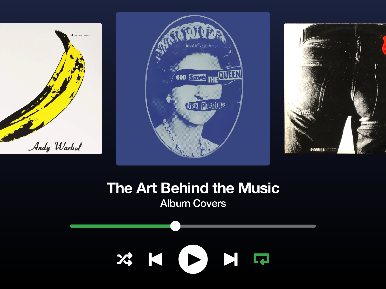
The Art Behind The Music – Iconic Album Covers
Words by Gamar Karimli
All of us have heard songs from internationally renowned bands like Pink Floyd, Iron Maiden, Rolling Stones, and Sex Pistols at least once in our lives, right?
Even so, is it possible that we will not immediately conjure up a particular picture, piece of graphic art, or poster in our minds when we hear those names? There’s a higher chance that we did rather not, which poses a question of whether graphic design and art direction in the music industry have proven to be as important.
When it comes to putting an intangible entity like music into visual form, two distinct artistic paths converge. It is nearly hard to think of a song or album and not be able to immediately visualize it. Artists and bands commission their singles or albums to be designed in order to stand out and be able to represent their musical style. Therefore, we are going to delve into the history behind the album covers of the most well-known artists and bands of the 20th century as well as take a peek at the artwork associated with them.
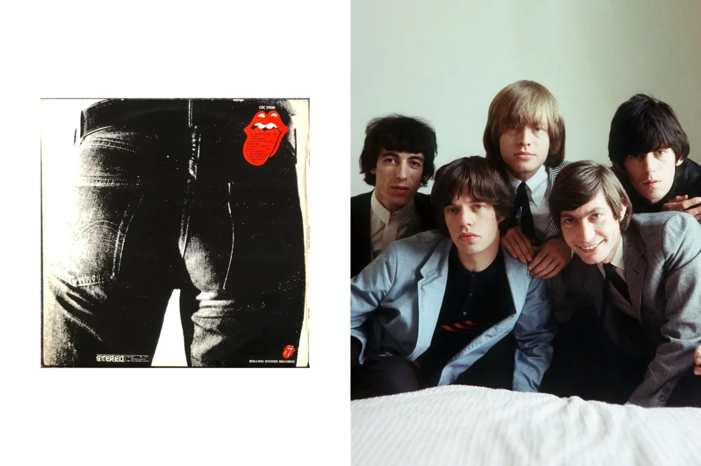
The Story of the Rolling Stones’ Tongue
John Pasche, then a design student at the Royal College of Art, created the iconic Rolling Stones’ tongue and lips logo, which debuted on the “Sticky Fingers” album in 1971. The design, inspired by the tongue of the Hindu goddess Kali, embodies the band’s rebellious spirit, Mick Jagger’s distinctive mouth, and sexual undertones. Pasche avoided using any Indian motifs to ensure the logo’s timeless appeal. Dissatisfied with their record company’s suggestions for their 1970 European Tour, the Stones sought a new visual identity, leading Mick Jagger to commission Pasche after being impressed by his college show work. Craig Braun and his team later refined the logo for mass production, enhancing its boldness and adaptability, making it a permanent fixture on the band’s albums, merchandise, and tours.
Initially paid just fifty pounds, Pasche eventually sold the copyright to the Stones. His original artwork is now housed in the Victoria and Albert Museum, purchased for £51,000. Andy Warhol’s influence on the album cover added a unique artistic flair, blending rock music with visual art. Warhol’s avant-garde touch complemented the “Sticky Fingers” cover, encapsulating the Stones’ essence and pioneering a groundbreaking fusion of art and music.
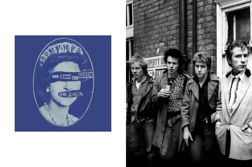
When the Sex Pistols “Saved” the Queen
Jamie Reid’s artwork for the Sex Pistols’ “God Save The Queen” single stands as a bold statement of punk rebellion, featuring a defaced image of Queen Elizabeth II. This iconic design, housed in the National Portrait Gallery in London and hailed by Q magazine as the best record cover art ever in 2001, embodies the raw energy of the UK’s anarchist and punk movements. Reid, a visionary born in 1947, used ransom note-style letters cut from newspapers to visually express the rebellious spirit of punk rock.
The famous 1977 design, created to mark the Queen’s silver jubilee, features a black-and-white portrait of the monarch with her mouth and eyes obscured, set against a Union Jack. This act of visual rebellion transforms the flag’s vivid colors into a critical canvas, with the fragmented royal face symbolizing a monarchy blind to social unrest. Reid’s collage, blending graphic chaos with typographic anarchy, subverts royalist ideals and captures the radical spirit of the punk movement. It was a daring piece of art, a potent symbol of artistic and political dissent.
Upon its 1977 release, the original cover of “God Save the Queen” sparked such controversy that it was nearly banned in the UK. The song’s critical stance against the British monarchy and establishment was seen as highly provocative and disrespectful by many. The Independent Broadcasting Authority, which regulated independent local radio stations, banned the song, and the BBC refused to play it. Many record stores and high street vendors also refused to stock the single, making it difficult for the public to obtain. Despite—or perhaps because of—this controversy and restricted availability, “God Save the Queen” became an iconic punk rock anthem, peaking at number two on the UK Singles Chart.
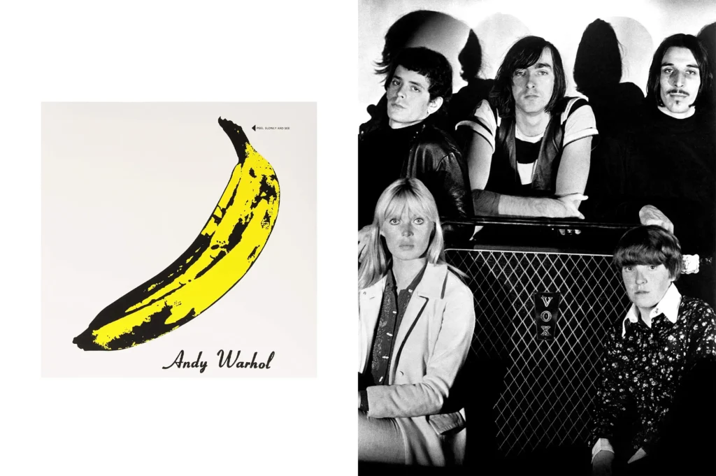
The Velvet Underground & Nico: Warhol’s Banana Cover
Andy Warhol transformed everyday objects into iconic art with “The Velvet Underground & Nico” album cover, much like his famous Campbell’s soup can artwork. Warhol created the banana image and placed it on the debut album of his favorite band, The Velvet Underground, for whom he served as manager and patron. Despite Warhol’s influence, the album sold only 30,000 copies in its first five years, which could be considered a commercial failure given his backing.
Interestingly, this album cover is unique as it names its designer, Acy R. Lehman, rather than the band or album title. This led to legal disputes over its imagery. Actor Eric Emerson filed the first lawsuit, claiming the unauthorized use of his photo. In response, Verve record group removed his picture from the cover, though it has since been reinstated in later reissues. In 2012, the Warhol Foundation faced another lawsuit from Lou Reed and John Cale, who argued that Warhol’s banana image was a gift to the band and not to be used by others without permission.
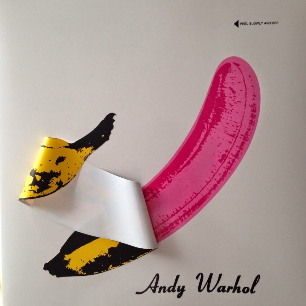
The original cover featured a peelable banana sticker revealing a pink banana underneath. This design was costly to produce, contributing to the album’s release delay. Warhol also participated in the photo shoot for the large image on the back cover, featuring Paul Morrissey and Hugo from Verve in a gatefold photo of the band.
Despite these challenges, the album’s March 1967 release marked a significant event, showcasing new directions in art and music. Warhol’s involvement and the innovative cover design underscored the avant-garde nature of the project, blending visual art and rock music in groundbreaking ways.
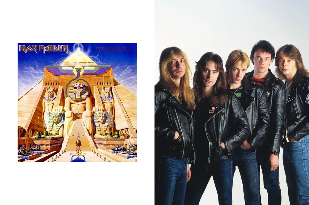
Iron Maiden – So, Who’s That Eddie?
Iron Maiden’s mascot, Eddie, is as legendary as their music. Designed by Derek Riggs, Eddie is a zombie-like character who has graced many of the band’s album covers, gaining iconic status in graphic design. Over the years, artists like Melvyn Grant, Tim Bradstreet, and Mark Wilkinson have refreshed Eddie’s appearance, keeping the mascot dynamic and relevant.
Eddie’s original character was anarchic and rebellious, inspired by punk culture and the DIY spirit of the late 1970s. The nickname “Eddie” came from “Ed the Head,” a mask the band used on stage before they could afford elaborate stage props. This mask, which used a hidden air pump to spew liquids, evolved into the band’s official mascot under Riggs’ creative direction.
The Iron Maiden logo, with its distinctive font, is also one of the most recognizable logos worldwide. The band’s bassist, Steve Harris, revised the logo after Denis Wilcocks of Crowes Art Studio created the original design in 1977.
Eddie made his debut as “Electric Matthew Says Hello,” a character Riggs created for a punk record. Iron Maiden’s management saw its potential and asked Riggs to tailor it to fit the band’s image. Eddie’s legacy in heavy metal was solidified when Riggs’ artwork featured on the band’s iconic covers throughout the 1980s and into the 1990s, starting with their 1980 album “Iron Maiden.”
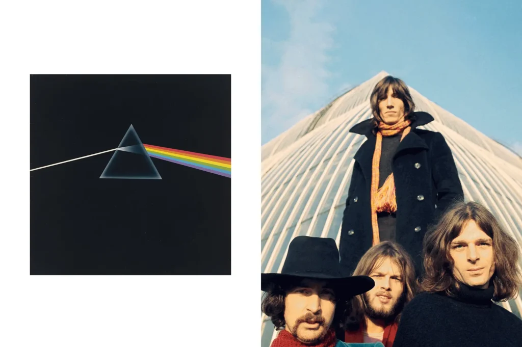
Pink Floyd – The Dark Side of the Moon
Storm Thorgerson, the man behind many iconic Pink Floyd images, designed the renowned “The Dark Side of the Moon” album cover. In an interview with Rolling Stone, Thorgerson revealed that the prism and light depicted on the cover were inspired by Pink Floyd’s stage lighting displays. This masterwork, created by Thorgerson’s design company Hipgnosis, has become a staple in band merchandise and frequently appears on lists of the “best album covers.” Its influence extends deeply into both pop culture and modern art.
Thorgerson himself was puzzled by the cover’s massive success. He recounted how Pink Floyd, seeking a departure from Hipgnosis’s usual surreal photos, requested something simple and graphic. The inspiration came from a magazine article on light refraction, sparking the idea of a prism. After sketching it, they presented the concept to the band, who immediately felt it captured their essence. This simple yet profound design has since become synonymous with Pink Floyd.
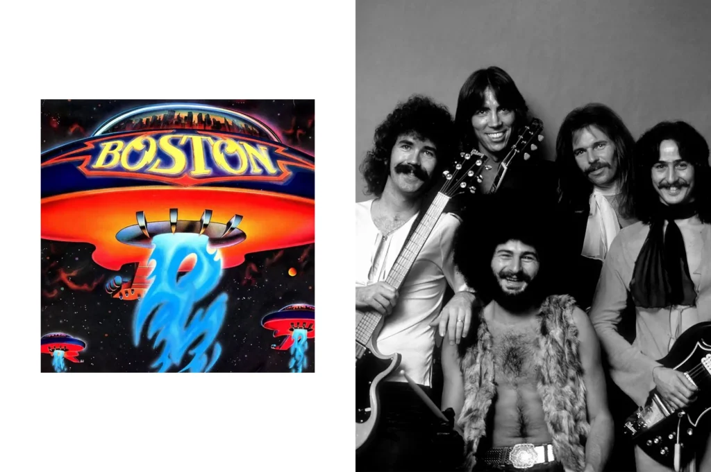
Boston – Debut Album
Released in August 1976, Boston’s first album quickly became a sensation, achieving gold and platinum status within months and earning the title of one of the fastest-selling debut albums in rock history. The cover, designed by Paula Scher, pays tribute to band founder Tom Scholz’s passion for technology and engineering, featuring guitars transformed into alien spacecraft with Earth exploding in the backdrop. Rock fans were captivated by Scher’s iconic image, which deviated from traditional band portraits and encouraged personal interpretation. Despite its creator considering it “mediocre,” the cover’s inventive design enhanced the music-listening experience, especially for fans exploring new experiences.
Check out our Instagram page for more inspirations > @velvele.studio