
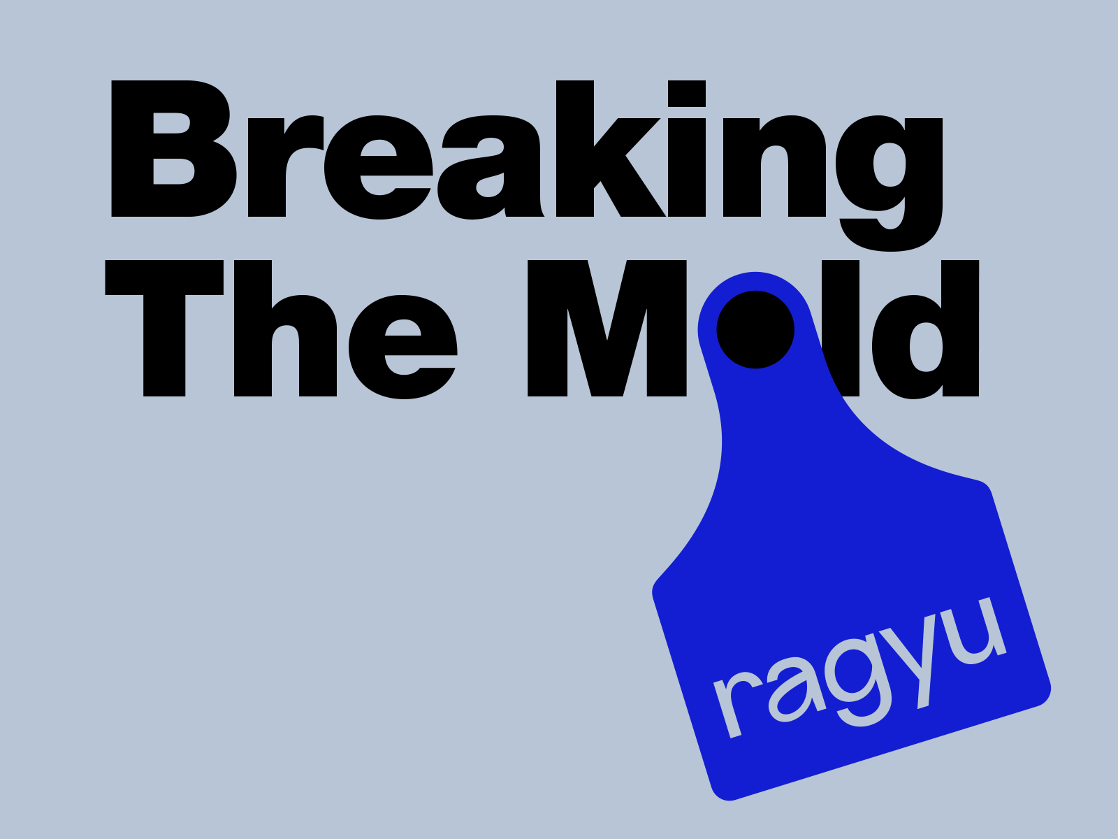
How we helped a butcher shop to escape the traditional branding trap
As branding experts, we are dedicated to taking a fresh and innovative approach to branding. When our client, who had a dream of opening a new-generation butcher shop in Turkey, approached us, we knew that we had to break away from the typical branding norms and think outside the box.
Traditional butcher shops often have a rustic aesthetic, including dark red and brown colors, meat, tool imagery, and homemade signs. While this may be charming and fitting for some, it can make it difficult for a new butcher shop to establish a memorable brand identity that stands out. By defying conventional branding norms, Ragyu was able to differentiate itself in a traditional industry and establish a unique and recognizable brand identity.
Did you know that according to a Forbes survey, 82% of investors consider brand strength and name recognition to be increasingly important in guiding their investment decisions? For consumers, shared values with a brand are the primary reason for their relationship with a brand, as stated by 64% of respondents. Furthermore, a Lucidpress study revealed that consistent branding across all channels can increase revenue by up to 33%. These figures underscore the significance of effective branding for businesses seeking to succeed in today’s competitive marketplace.
We recognize that in-depth research and analysis to comprehend the market and identify trends are critical to developing a strong brand identity that resonates with your audience. That is why we prioritize this step and go above and beyond to ensure that we develop the best concept for our clients. Our approach enables us to create a brand identity that not only reflects your company’s values but also stands out in the market, making it easier for your customers to recognize and connect with your brand. Furthermore, by ensuring consistency across all channels, we can help you increase your revenue, as demonstrated by the Lucidpress study.
Consistent branding across all channels can increase revenue by up to 33%.
Designing the Icon: How the Ear Tag Became the Key Symbol
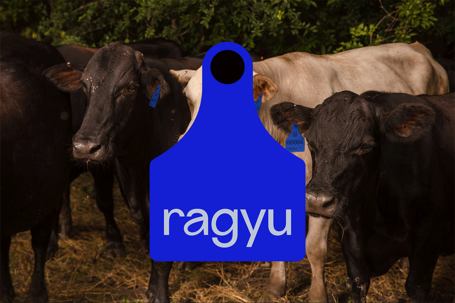
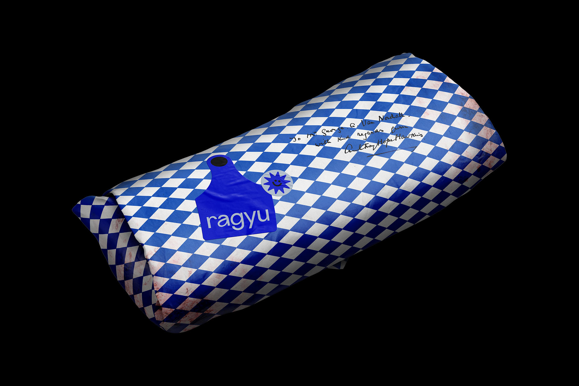
When developing the branding for ragyu, we aimed to strike a balance between modernity and tradition. We sought a symbol that would immediately capture attention and convey the idea of superior quality meat, while also resonating with customers on a deeper level. That’s when we conceived the concept of using the ear tag shape as the brand’s main symbol. The ear tag is a traditional method of identifying livestock, and by employing this shape as our primary symbol, we were able to pay homage to the traditional butchery while also communicating the notion of premium-quality meat. The ear tag symbol is also an ideal representation of a new-generation butcher shop, which prioritizes high-quality, locally sourced meat. It’s a bold and imaginative choice that has proven to be exceedingly effective in conveying the values and identity of the Ragyu brand.
We aimed to strike a balance between modernity and tradition.
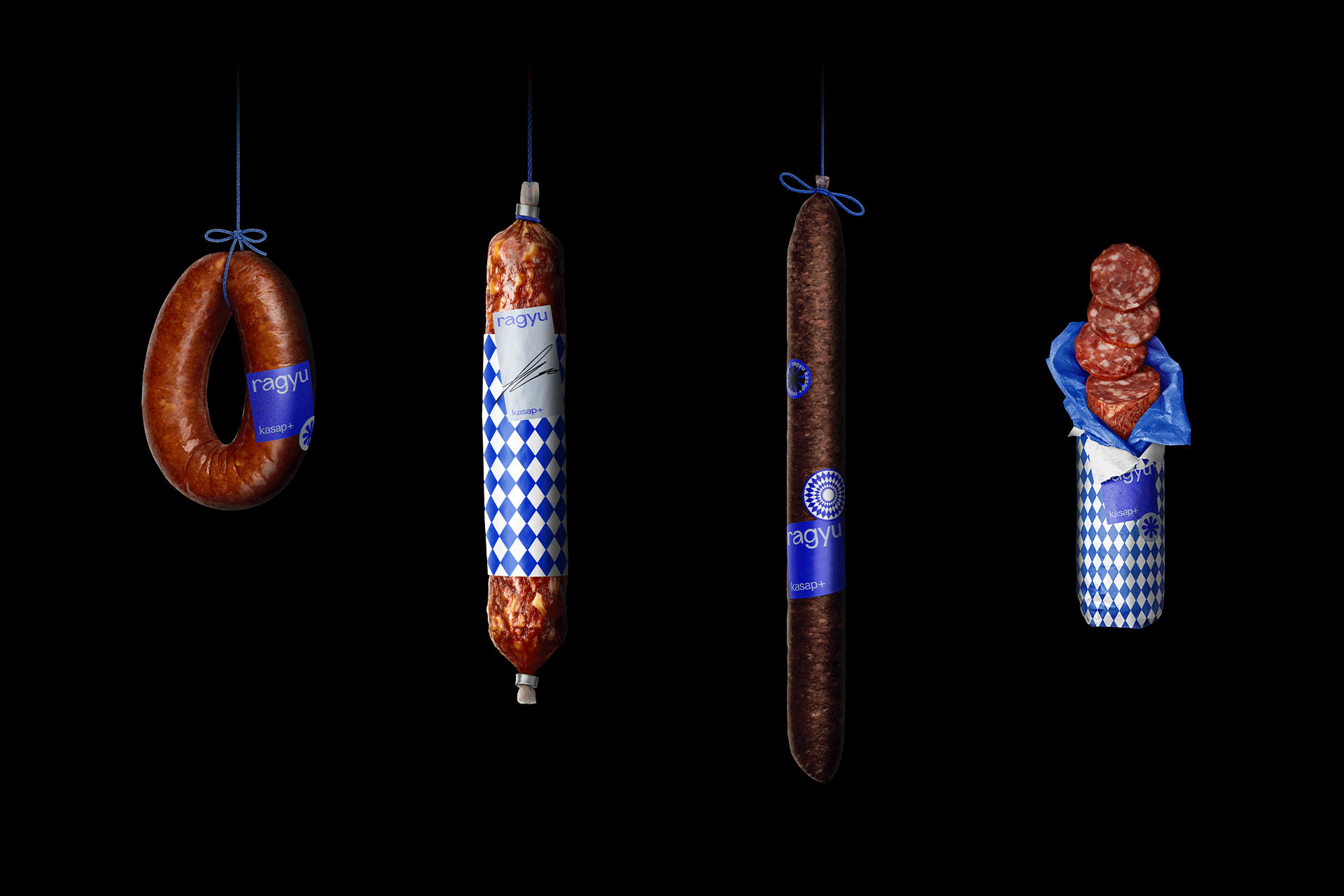
The unexpected color choice: Ragyu’s Blue
Color selection plays a vital role in establishing a memorable and effective brand identity. For the new-generation butcher shop, Ragyu, we sought an unconventional color for its branding: blue. While blue may not be an obvious choice for a butcher shop, the use of a contemporary and sophisticated shade created a striking contrast with the traditional red meat color, giving the brand a unique appearance on the shelves.
We drew inspiration from the famous Yves Klein blue, a rich and vibrant hue associated with creativity, innovation, and sophistication. Moreover, blue is scientifically proven to stimulate appetite, making it an excellent choice for a food-related business.
The incorporation of this unconventional color in all branding elements, from packaging to labels, enabled Ragyu to create a consistent and eye-catching brand identity that distinguishes it from its competitors. The blue Ragyu branded bags, in particular, served as a powerful marketing tool, making the brand instantly recognizable and memorable.
We drew inspiration from the famous Yves Klein blue, a rich and vibrant hue associated with creativity, innovation, and sophistication.
Unlocking the Power of Brand Marks: How Ragyu Used Playful and Innovative Design to Stand Out
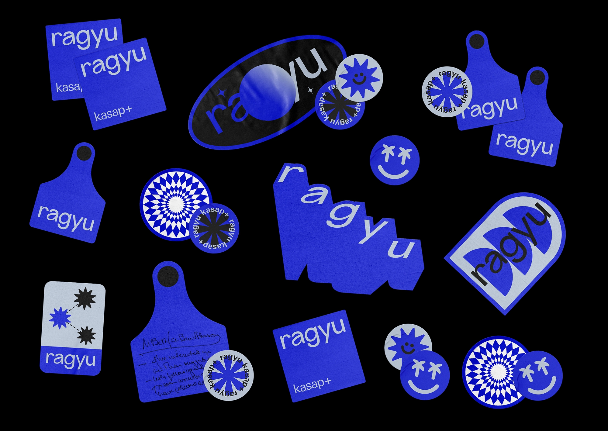
To add a playful and innovative touch to the brand, we created a variety of Ragyu marks that we use as stickers on the packaging. Each of these unique designs represents a different aspect of the brand’s identity, showcasing its personality and identity. With a central theme of “Ragyu is a planet where the meat is blue,” we created brand marks featuring planets, stars, and other celestial objects rendered in shades of blue, resulting in a series of imaginative and playful designs. By using these marks on the packaging, we created a unique experience for customers.
With each purchase, customers could receive a different Ragyu stickers on their packaging, generating a sense of anticipation and excitement. This approach reinforced the brand’s innovative and creative marketing strategy, establishing Ragyu as a leader in the new-gen butcher industry. The use of these marks also added a playful touch to the brand, while still maintaining its sophisticated and modern appeal, ultimately contributing to a memorable and effective brand identity.
With each purchase, customers could receive a different Ragyu stickers on their packaging, generating a sense of anticipation and excitement. This approach reinforced the brand’s innovative and creative marketing strategy, establishing Ragyu as a leader in the new-gen butcher industry. The use of these marks also added a playful touch to the brand, while still maintaining its sophisticated and modern appeal, ultimately contributing to a memorable and effective brand identity.
With each purchase, customers could receive a different Ragyu mark on their packaging, generating a sense of anticipation and excitement.

Packaging and Labeling: Every Detail Counts in Building a Strong Brand Identity
In the realm of branding, even the most seemingly straightforward elements can wield a significant impact. For Ragyu, the utilization of blue branded paper bags proved to be an efficacious marketing tool. These bags, designed with a modern look and feel that corresponded with the overall branding, became a standout feature in an industry steeped in tradition. Not only were they aesthetically pleasing and alluring, but they also functioned as mobile advertisements for the brand.
Customers who departed the store carrying these bags became brand ambassadors, spreading the word about Ragyu to anyone they encountered on the street. This simple, yet effective tactic not only heightened brand recognition, but it also generated a buzz around the new-gen butcher shop. It’s a testament to the fact that every component of packaging and labeling can serve as a robust marketing tool, even something as seemingly trivial as a paper bag. By attentively focusing on the details and considering how each aspect of packaging and labeling can contribute to branding, businesses can develop a unified and potent brand identity that resonates with customers and propels them towards success.
Customers who departed the store carrying these bags became brand ambassadors, spreading the word about Ragyu to anyone they encountered on the street. This simple, yet effective tactic not only heightened brand recognition, but it also generated a buzz around the new-gen butcher shop. It’s a testament to the fact that every component of packaging and labeling can serve as a robust marketing tool, even something as seemingly trivial as a paper bag. By attentively focusing on the details and considering how each aspect of packaging and labeling can contribute to branding, businesses can develop a unified and potent brand identity that resonates with customers and propels them towards success.
Customers who departed the store carrying these bags became brand ambassadors, spreading the word about Ragyu to anyone they encountered on the street.
Setting Your Brand Apart: The Power of Distinctive Design Elements
In our pursuit to make Ragyu’s branding stand out and be unforgettable, we opted to integrate a unique and distinguishing feature – the diamond pattern. This pattern was cleverly employed on the food contact paper to envelop meats directly, creating a visually captivating packaging design that exuded an air of luxury for the brand. However, the diamond pattern was more than just a one-time decorative element; it evolved into a signature feature of Ragyu’s branding, establishing a visual correlation with the brand. Presently, customers instantly identify the diamond pattern as an emblem of Ragyu’s brand identity, even without the presence of the brand name or logo. This serves to heighten brand recognition and awareness, as well as foster a sense of familiarity and confidence with customers. By incorporating such a unique and distinctive feature like the diamond pattern, we effectively set Ragyu apart from its competitors, creating a one-of-a-kind and memorable visual identity that deeply resonates with customers.
Customers instantly identify the diamond pattern as an emblem of Ragyu’s brand identity, even without the presence of the brand name or logo.
The Power of Design Awards and Recognition in Building a Memorable Brand Identity
Our unorthodox approach to branding for Ragyu has yielded significant success, resulting in numerous awards and accolades. Furthermore, our work has been highlighted in prominent design blogs in the industry. We aspire to inspire other businesses to think outside the box and take risks to stand out in their respective industries. By investing in a comprehensive branding strategy, businesses can create a distinctive and effective brand identity that generates long-term success.
Winning design awards and recognition can significantly impact a business’s prosperity. These awards not only showcase a business’s design proficiency but also serve as a stamp of approval from industry experts, establishing credibility and trust with customers. From a business perspective, winning design awards and recognition can increase brand awareness and recognition on a global level, allowing the business to reach thousands of people, including potential investors, customers, and partners, through the awards ceremony and industry publications. Additionally, design awards and recognition can attract media attention, providing more exposure and opportunities for the business. Ultimately, investing in a comprehensive branding strategy that includes entering design awards and seeking recognition can establish a memorable and effective brand identity that drives long-term success.
Winning design awards and recognition can significantly impact a business’s prosperity. These awards not only showcase a business’s design proficiency but also serve as a stamp of approval from industry experts, establishing credibility and trust with customers. From a business perspective, winning design awards and recognition can increase brand awareness and recognition on a global level, allowing the business to reach thousands of people, including potential investors, customers, and partners, through the awards ceremony and industry publications. Additionally, design awards and recognition can attract media attention, providing more exposure and opportunities for the business. Ultimately, investing in a comprehensive branding strategy that includes entering design awards and seeking recognition can establish a memorable and effective brand identity that drives long-term success.
From a business perspective, winning design awards and recognition can increase brand awareness and recognition on a global level, allowing the business to reach thousands of people, including potential investors, customers, and partners, through the awards ceremony and industry publications.
Don’t miss out on the opportunity to create a powerful brand that resonates with your audience and differentiates you from the competition. Contact us today to learn more about how we can help your business succeed through effective branding.